
LOGO
- Renee Wong
- Dec 12, 2018
- 1 min read
Updated: Jan 31, 2019
Before deciding or creating on a logo, a research of Aster + Luna's competitors logo was conducted. As seen below is the competitors' logo.


Analysis:
Non of the above brands uses "cute" fonts or colourful, bright colour. In fact, most of the logos is either monocoloured or two colours.
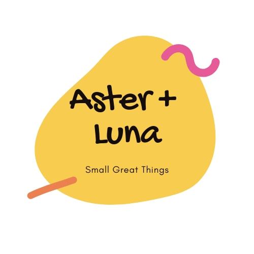
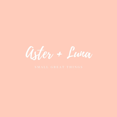
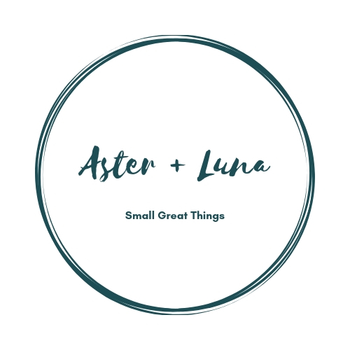
Logo draft & options created


All images courtesy of (Wong, 2018)
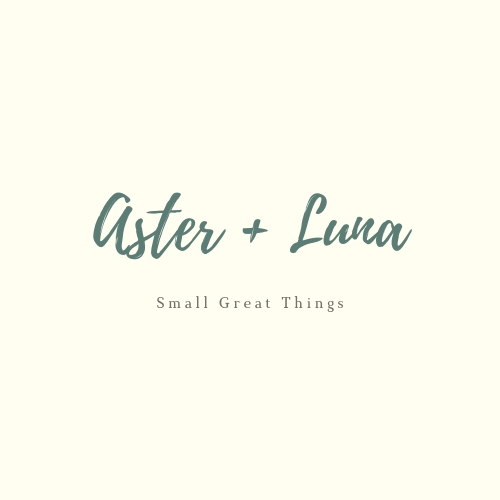
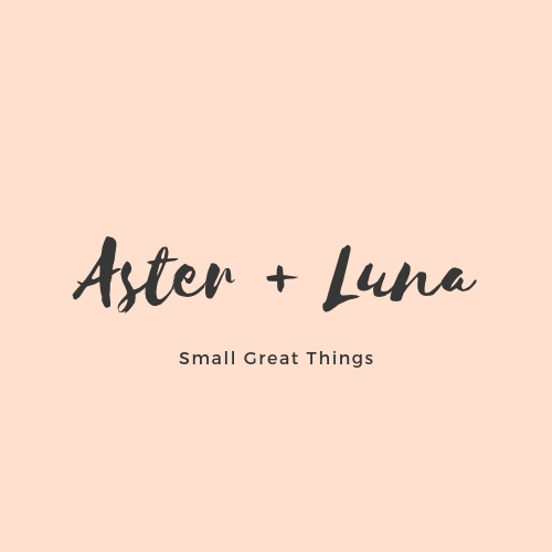
Finalised logo

Aster + Luna’s logo design represents the brand’s identity. The logo aims to deliver trust, quality, professionalism and a sense of nature to the audience since babywear rental services can be discouraging at first impression. Hence, playful, bright colours with organic shapes commonly used for kidswear brand are avoided. As seen below are the psycological reasons behind Aster + Luna’s logo design.
Psycological reasons behind Aster + Luna’s logo design

Fonts selection

Thank You,
Renee Wong
Bibliography:
Google Fonts (2018). Logo. [image] Available at: https://fonts.google.com/specimen/Playfair+Display [Accessed 30 Jan. 2019].
DPULZE (n.d.). Poney Logo. [image] Available at: http://dpulze.com/wp/tenants/poney-opening-soon/ [Accessed 30 Jan. 2019].
Wong, R. (2018). Logo. [image].
Johnson & Johnson (n.d.). [image] Available at: https://upload.wikimedia.org/wikipedia/commons/thumb/2/22/JohnsonandJohnsonLogo.svg/1000px-JohnsonandJohnsonLogo.svg.png [Accessed 30 Jan. 2019].
IKW (n.d.). [image] Available at: http://ikw.com.my/pureen/?page=2 [Accessed 30 Jan. 2019].
Vectorise Logo (n.d.). Anakku. [image] Available at: https://vectorise.net/logo/2010/05/22/anakku/ [Accessed 30 Jan. 2019].


Comments